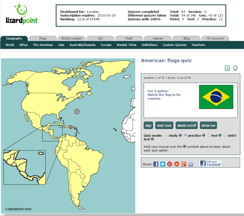
Jan 162016We've just launched two new quizzes to test your country flag knowledge. We'll show you a flag, you have to find the country on the map. The Africa and Europe versions have been around a long time: now we've got an Americas flag quiz as well as an Asia flag quiz.
As promised, our supporters get early access to new quizzes and features. For everyone else, the new quizzes will open up to you on February 1, 2016.
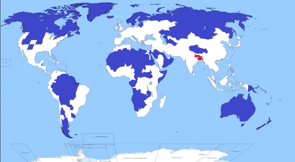
Jan 132016 Another very interesting visualization of world population from the folks in Reddit. Only 5 per cent of the world's population lives in the regions of this map shaded blue. Another 5 per cent lives in the area shaded red.
Reddit MapPorn - account IbisDigitalMedia
We found the map in a very interesting article from the web site CityMetric, who included some interesting facts and deduction.
According to CityMetric, the red area includes Bangladesh (pop: 156m), and the Indian states of Bihar (pop: 104m) and West Bengal (pop: 91m). It also includes two megacities: Kolkata in West Bengal (15m), and the Bangladeshi capital of Dhaka (13m). In all, that’s a combined population of about 351m people in roughly 330,000 km2, giving a population density of 1062 people per km2.
The blue area includes Canada, Greenland, Iceland, Norway, Sweden, Finland, Estonia, Latvia, Lithuania, huge swathes of northern and Asian Russia, Mongolia, most of the Amazon basin, Patagonia, large swathes of Africa and the Arabic peninsula, the US states of New Mexico, Nevada, Utah, Kansas, Nebraska, Idaho, Wyoming, Montana, and both Dakotas, and pretty much the entire Australasian continent.
As CityMetric points out, the map is a bit of a cheat. They've assumed that whoever made the map calculated how many people 5 per cent of the global population is, and then started working their way down a list of big areas with low population density until they hit their magic number. It’s a slightly artificial way of doing things, and leads to odd things like the exclusion of the Nile valley and the thin sliver of South America on its populated Pacific Coast.
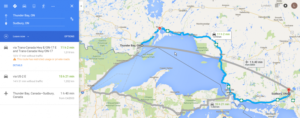
Jan 112016While everyone else this morning is reeling over the death of David Bowie, I'm far more shocked at the news that Canada has just been cut in half!
Living in a metropolitan area of over 6 million people, I often forget just how remote and isolated much of Canada is. And I never imagined that one bridge in the middle of Canada was the only thing joining the west with the east.
Due to extreme weather conditions, the Nipigon River Bridge has failed, causing one side of it to rise two feet. This bridge is on the Trans-Canada Highway, which you may gather from the name, is a highway that goes pretty much right across Canada.
“Canada has been cut in half,” said Nipigon Mayor Richard Harvey. “If you want to take something from Toronto to B.C., it goes across this bridge. There is no alternative. Every truck that goes across Canada goes across this bridge.” (Quote from the Toronto Star article on the bridge closure.)
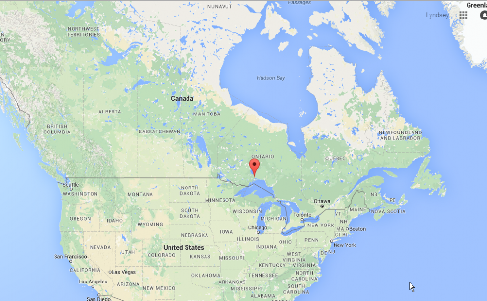
Location of the bridge failure in Nipigon, Ontario. (Image credit: Google maps)
Zooming in, you can see the Trans-Canada Highway is pretty much the only road around. Other minor roads shown in grey just service local communities.
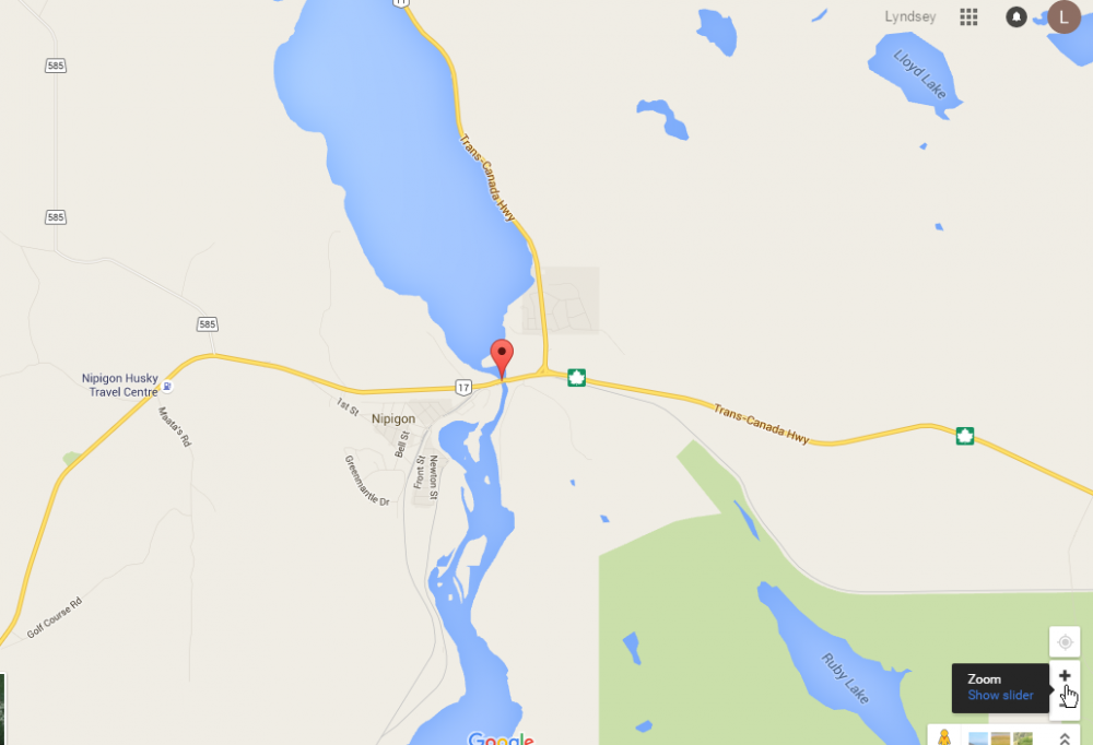
Detailed map of Nipigon River Bridge location, showing Trans-Canada Highway. (Image credit: Google maps)
While the bridge is closed for who knows how long, all trans-Canada traffic must now take a detour through the US.
Gotta love Google, they're on top of things, already showing that the bridge is closed, and what the detour is. It looks like the additional travel time is 4.5 hours, plus however long the border crossings will take.
Detailed map of Nipigon River Bridge location, showing Trans-Canada Highway. (Image credit: Google maps)
This is a matter of national security, and will cause some serious economic impact, and I imagine will be the source of a lot of jokes. The perfect storm of Canada's renowned cold weather and remoteness.
Jan 062016Drones are much in the news these days as prices fall and make the technology more and more accessible. Most of the interest is in the flying types of drones, but a recent GEOGRAPHICAL item discusses a different type of drone that has the potential to make new geographical knowledge available. As part of a growing interest in underwater drones, a start-up company called Hydroswarm is developing a robot to map the seafloor in greater detail.
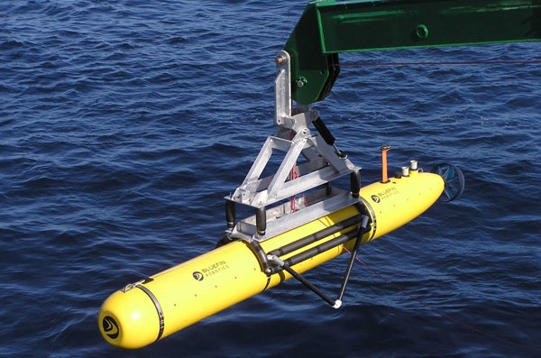
Bluefin-21, the underwater drone of US navy sent to locate the debris of missing Malaysian plane MH370,
The EVE robot is a pumpkin-shaped bot is made for searching the sea. Made up of one part steering mechanism and one part ultrasound sensor, the autonomous drone could be more useful than existing remotely-operated robots as ‘they are less complex, but smart in terms of sensing,’ according to Sampriti Bhattacharyya, mechanical engineer at Massachusetts Institute of Technology and EVE’s creator.
Still in its development stage, the drone can only dive 250 metres below the surface. However, Bhattacharyya has ambitions towards using this kind of technology to create a deeper ‘Google Maps’ of the sea. ‘The whole point of Hydroswarm is to provide a cheap and scalable method of mapping the ocean,’ she says. ‘EVE can be used as a single drone, or as a bunch of them working together to map large areas.’ Deployed en masse, the drones use algorithms to communicate with each other in a network. Plus, they don’t get lost. ‘They have a homing mechanism and are recovered at the end of their missions,’ she says.
Beyond Hydroswarm - hobbyists can examine other startups with their own versions of underwater drones. Fathom and OpenROV both have interesting technologies and approaches.
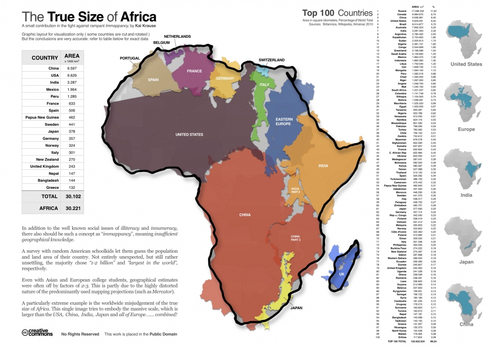
Dec 292015Another brilliant graphic that illustrates the true size of Africa (click on the map to see the full sized version).
This graphic very visually demonstrates that Africa alone is larger (in terms of area) than China, USA, India, Mexico, and much of Europe and South America. The power of this graphic and the surprise that it creates for readers, is based on the deep impressions made by the Mercator projection used in most maps that distorts the true size of many countries. This projection, published in 1569, was immediately useful because it depicts a line of constant bearing as a straight line, which is handy for marine navigation. The drawback is that it distorts the shapes and areas of large land masses, and the distortion gets progressively worse as you get closer to the poles.
Dec 082015We kind of get used to some pretty amazing technologies. For instance, GPS (or Global Positioning System) has only been available to consumers for a little over 10 years. Yet, most of us have already become pretty dependent on our GPS enabled devices. It is rare to drive in a car without a GPS device and almost every smartphone will be enabled. (And some of us use these devices to enjoy geocaching as we've talked about before). But how many people understand how they work? We're going to explain that to you... simply (because that's about our level of understanding).
Let's start with satellites. There are about thirty or so satellites continually circling the earth at about 30,000 kms (12,000 miles). These are solar-powered satellites each about the weight of a mid-sized car. These satellites are always sending encoded signals in every direction. The orbits of the satellites are designed so that at least 4 and usually more, are in line of sight to every point on earth at all times. It actually takes about 24 satellites to provide this coverage - but the extras are there in case replacements are needed. The signals can go through clouds and glass and gasses - but not through solids... so you will not be able go get a location fix when you're underground - or under a deep tree canopy in a forest.
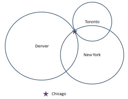
Now back on earth, these satellite signals are received with your GPS device. Essentially, your device will decode the signal, figure out how long ago it was sent and from that information it can compute it's distance from the satellite. So, how does your distance from a faraway satellite help locate you? It happens though a process called 'trilateration'. Big word, but fairly simple idea. Imagine you were situated somewhere in the middle of the USA. And you had a big map in front of you. Imagine you were given 3 figures, each a distance from a fixed location. For example, New York - 713 miles; Denver - 913 miles; and Toronto - 437 miles. With this information you could use the map scale to draw three big circles from each of the fixed locations. And the three circles would intersect in only one place - Chicago.
So that's fine for fixed locations on earth - but satellites? It turns out to be only a little more complicated in that case. Because satellites are in space, when you have the distance, you have to think about the possible locations as being on the edge of a sphere instead of the circle we drew on the map. And your location would be the intersection of the spheres from each of the 4 satellites your device was using.
The rest of the story is simply software. Your GPS device will calculate the location as a pair of co-ordinates. One is latitude (your north/south position) and the other longtitude (your east/west position). For instance, Chicago is roughly 41° 46' 0" latitide and -87° 37' 20" longtitude. Then, your device will usually overlay this coordinate on a map that it has in its memory. All that to tell you how to find the way to Aunt Sally's new house!
