
The area of this map coloured red has the same population as the area coloured blue
Jan 132016Another very interesting visualization of world population from the folks in Reddit. Only 5 per cent of the world's population lives in the regions of this map shaded blue. Another 5 per cent lives in the area shaded red.
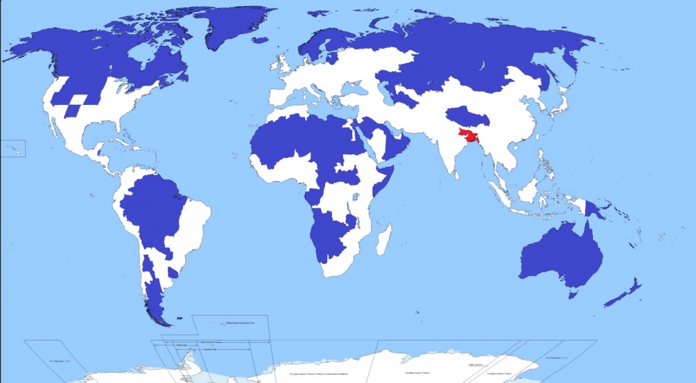
We found the map in a very interesting article from the web site CityMetric, who included some interesting facts and deduction.
According to CityMetric, the red area includes Bangladesh (pop: 156m), and the Indian states of Bihar (pop: 104m) and West Bengal (pop: 91m). It also includes two megacities: Kolkata in West Bengal (15m), and the Bangladeshi capital of Dhaka (13m). In all, that’s a combined population of about 351m people in roughly 330,000 km2, giving a population density of 1062 people per km2.
The blue area includes Canada, Greenland, Iceland, Norway, Sweden, Finland, Estonia, Latvia, Lithuania, huge swathes of northern and Asian Russia, Mongolia, most of the Amazon basin, Patagonia, large swathes of Africa and the Arabic peninsula, the US states of New Mexico, Nevada, Utah, Kansas, Nebraska, Idaho, Wyoming, Montana, and both Dakotas, and pretty much the entire Australasian continent.
As CityMetric points out, the map is a bit of a cheat. They've assumed that whoever made the map calculated how many people 5 per cent of the global population is, and then started working their way down a list of big areas with low population density until they hit their magic number. It’s a slightly artificial way of doing things, and leads to odd things like the exclusion of the Nile valley and the thin sliver of South America on its populated Pacific Coast.