While everyone else this morning is reeling over the death of David Bowie, I'm far more shocked at the news that Canada has just been cut in half!
Living in a metropolitan area of over 6 million people, I often forget just how remote and isolated much of Canada is. And I never imagined that one bridge in the middle of Canada was the only thing joining the west with the east.
Due to extreme weather conditions, the Nipigon River Bridge has failed, causing one side of it to rise two feet. This bridge is on the Trans-Canada Highway, which you may gather from the name, is a highway that goes pretty much right across Canada.
“Canada has been cut in half,” said Nipigon Mayor Richard Harvey. “If you want to take something from Toronto to B.C., it goes across this bridge. There is no alternative. Every truck that goes across Canada goes across this bridge.” (Quote from the Toronto Star article on the bridge closure.)
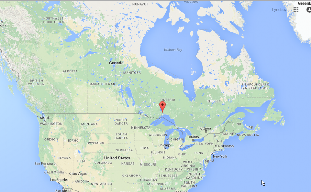
Location of the bridge failure in Nipigon, Ontario. (Image credit: Google maps)
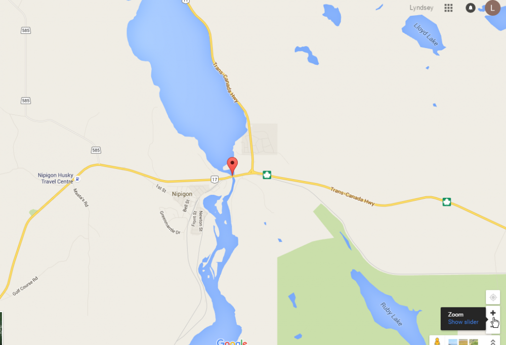
Zooming in, you can see the Trans-Canada Highway is pretty much the only road around. Other minor roads shown in grey just service local communities.
Detailed map of Nipigon River Bridge location, showing Trans-Canada Highway. (Image credit: Google maps)
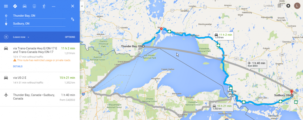
While the bridge is closed for who knows how long, all trans-Canada traffic must now take a detour through the US.
Gotta love Google, they're on top of things, already showing that the bridge is closed, and what the detour is. It looks like the additional travel time is 4.5 hours, plus however long the border crossings will take.
Detailed map of Nipigon River Bridge location, showing Trans-Canada Highway. (Image credit: Google maps)
This is a matter of national security, and will cause some serious economic impact, and I imagine will be the source of a lot of jokes. The perfect storm of Canada's renowned cold weather and remoteness.
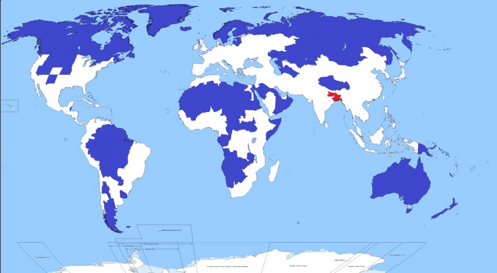
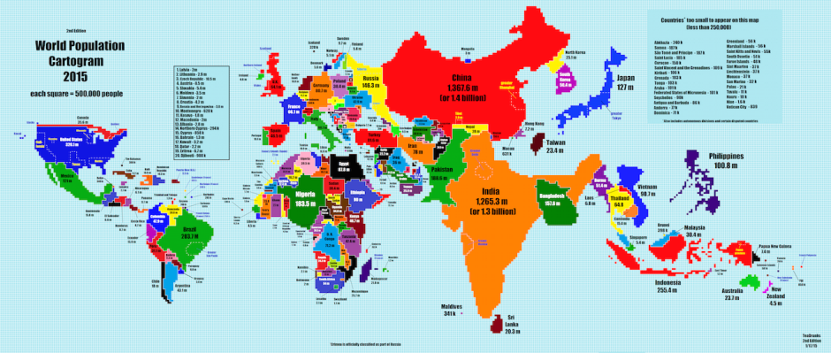
Another very interesting visualization of world population from the folks in Reddit. Only 5 per cent of the world's population lives in the regions of this map shaded blue. Another 5 per cent lives in the area shaded red.
Reddit MapPorn - account IbisDigitalMedia
We found the map in a very interesting article from the web site CityMetric, who included some interesting facts and deduction.
According to CityMetric, the red area includes Bangladesh (pop: 156m), and the Indian states of Bihar (pop: 104m) and West Bengal (pop: 91m). It also includes two megacities: Kolkata in West Bengal (15m), and the Bangladeshi capital of Dhaka (13m). In all, that’s a combined population of about 351m people in roughly 330,000 km2, giving a population density of 1062 people per km2.
The blue area includes Canada, Greenland, Iceland, Norway, Sweden, Finland, Estonia, Latvia, Lithuania, huge swathes of northern and Asian Russia, Mongolia, most of the Amazon basin, Patagonia, large swathes of Africa and the Arabic peninsula, the US states of New Mexico, Nevada, Utah, Kansas, Nebraska, Idaho, Wyoming, Montana, and both Dakotas, and pretty much the entire Australasian continent.
As CityMetric points out, the map is a bit of a cheat. They've assumed that whoever made the map calculated how many people 5 per cent of the global population is, and then started working their way down a list of big areas with low population density until they hit their magic number. It’s a slightly artificial way of doing things, and leads to odd things like the exclusion of the Nile valley and the thin sliver of South America on its populated Pacific Coast.
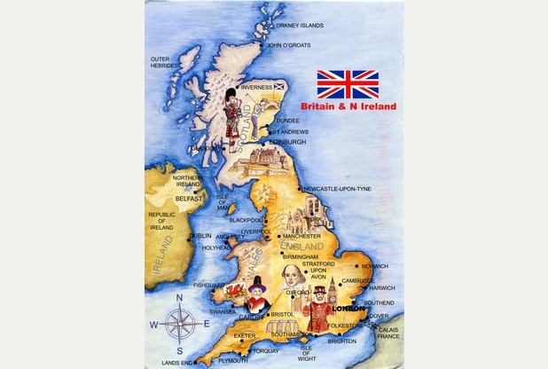
We think our American friends take a lot of teasing in the press every now and then when a survey comes out revealing gaps in geography knowledge. So we thought it only fair to report on a story out of Northampton in the UK.
The recent Travelodge survey reveals some shocking facts:
about 1 in 10 (11%) believe the UK is made up of more than 6 countries,
Almost the same (9%) believe that England alone makes up the UK,
Over half (54%) think that the UK has a bigger island than Great Britain,
In fact, over one third didn't know the difference between the UK and Great Britain, and
None of the respondents knew how many islands surround the mainland.
Well, to be honest, the answer to that last one (over 6,000) surprised us. However, look for that question to be in an upcoming Trivia quiz. But we do expect all our viewers to get perfect on this quiz.
Now, if you really want to to understand the British Isles a little better, we heartedly recommend the following video (watch until about 2:15 = although the rest is interesting too).
We get a lot of requests for a quiz of the whole world. And we've struggled with this for over a year. Why? Two reasons - would anybody REALLY have the patience to answer over 190 questions? And how would this really work, technically speaking, because many of the countries would be too small to click on. And no, we can't implement a zoom in/out technology like Google maps uses... it just flat out won't work with the way our quizzes are coded.
We tried a whole world quiz a while back that incorporates a slide bar to move yourself through the world, thus avoiding the difficulty of clicking on something really small. But it doesn't work on touch screens.
But we might be getting close to a solution, and we'd like your feedback.
There's a bit of extra navigation that happens with this style of quiz: you start at a map of the continents, and you must select one before you answer the question. Sometimes, after you've answered a question, the next random question is conveniently in the same continent. Often, it's not, and you have to navigate back to the world map to pick another continent.
There are 3 ways to get back to the world map:
We'd love your feedback... try one or both of the quizzes and leave us a comment below, or send us an email. Just, please, don't suggest that we use zoom in/out maps, because technically, it's not going to work.
If all goes well and people like this style of quiz well enough, we'll make it customizable, and you'll be able to create world quizzes with the countries of your choosing.
We kind of get used to some pretty amazing technologies. For instance, GPS (or Global Positioning System) has only been available to consumers for a little over 10 years. Yet, most of us have already become pretty dependent on our GPS enabled devices. It is rare to drive in a car without a GPS device and almost every smartphone will be enabled. (And some of us use these devices to enjoy geocaching as we've talked about before). But how many people understand how they work? We're going to explain that to you... simply (because that's about our level of understanding).
Let's start with satellites. There are about thirty or so satellites continually circling the earth at about 30,000 kms (12,000 miles). These are solar-powered satellites each about the weight of a mid-sized car. These satellites are always sending encoded signals in every direction. The orbits of the satellites are designed so that at least 4 and usually more, are in line of sight to every point on earth at all times. It actually takes about 24 satellites to provide this coverage - but the extras are there in case replacements are needed. The signals can go through clouds and glass and gasses - but not through solids... so you will not be able go get a location fix when you're underground - or under a deep tree canopy in a forest.
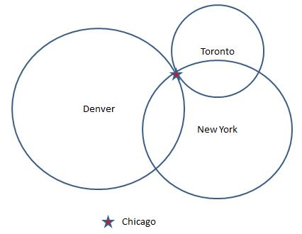
Now back on earth, these satellite signals are received with your GPS device. Essentially, your device will decode the signal, figure out how long ago it was sent and from that information it can compute it's distance from the satellite. So, how does your distance from a faraway satellite help locate you? It happens though a process called 'trilateration'. Big word, but fairly simple idea. Imagine you were situated somewhere in the middle of the USA. And you had a big map in front of you. Imagine you were given 3 figures, each a distance from a fixed location. For example, New York - 713 miles; Denver - 913 miles; and Toronto - 437 miles. With this information you could use the map scale to draw three big circles from each of the fixed locations. And the three circles would intersect in only one place - Chicago.
So that's fine for fixed locations on earth - but satellites? It turns out to be only a little more complicated in that case. Because satellites are in space, when you have the distance, you have to think about the possible locations as being on the edge of a sphere instead of the circle we drew on the map. And your location would be the intersection of the spheres from each of the 4 satellites your device was using.
The rest of the story is simply software. Your GPS device will calculate the location as a pair of co-ordinates. One is latitude (your north/south position) and the other longtitude (your east/west position). For instance, Chicago is roughly 41° 46' 0" latitide and -87° 37' 20" longtitude. Then, your device will usually overlay this coordinate on a map that it has in its memory. All that to tell you how to find the way to Aunt Sally's new house!
One of the things that interest us at Lizard Point are visualizations that provide a different perspective on the world we inhabit. Maps are especially good at this. And not all maps have to be physical (showing geographic features) or political (showing state boundaries). The map above, recently featured in the Washington Post, is a World Population Cartogram. According to Wikipedia, A cartogram is a map in which some thematic mapping variable – such as travel time, population, or Gross National Product – is substituted for land area or distance. The geometry or space of the map is distorted in order to convey the information of this alternate variable. I think you would agree that the perspectives provided by this map are quite different that the maps we usually see.
Any insights you get from the map depend on your own perspective. For instance, we at Lizard Point live in Canada, a huge country in terms of land mass. But as the cartogram illustrates, a very small country when it comes to population. Even our neighbours to the south in the populous United States, shrink a little when compared to the populations of India and China. A few other surprising insights that we found;
the relatively small size of Russia (less populous than Nigeria),
the large size of some of the Caribbean countries (Cuba, Haiti, Dominican Republic), and
the complete absence of large countries such as Greenland and Iceland.
And don't forget that Lizard Point quizzes has population (and much more) information about all the countries in our site. Just click on the 'study' button.